Seeing Signals: How Frequency Shapes the World Around Us
Discover how frequency analysis forms the backbone of modern technology, from image processing to medical imaging, and how understanding frequencies offers a philosophical lens into the nature of reality itself.

Seeing Signals: How Frequency Shapes the World Around Us
The Hidden Language of Reality
Have you ever stood on a shoreline, watching waves crash against the rocks? Or perhaps you've felt the gentle vibration of a buzzing phone in your pocket? These experiences, seemingly disconnected, share a profound commonality – they are expressions of frequency, nature's fundamental language that governs everything from the smallest quantum vibrations to the largest cosmic oscillations.
What if I told you that your entire perception of reality is, in essence, your brain's interpretation of frequencies?
The colors you see, the sounds you hear, the textures you feel – all are manifestations of waves with different frequencies. Even more fascinating is that mathematics has given us the tools to speak this language, to decode these patterns, and in the process, to unveil realities invisible to our biological senses.
As an electrical engineer working at the intersection of signal processing and artificial intelligence, I've come to see frequency analysis as more than just a technical tool. It's a philosophical lens through which we can understand how information flows through systems, whether those systems are digital computers, human brains, or the natural world around us.
This perspective transforms signal processing from an abstract mathematical exercise into something profoundly connected to our experience of being.
Let us embark on a journey to understand how frequency shapes our world, and how teaching machines to "see" in the frequency domain has unlocked some of the most powerful technological advances of our time.
The Art of Signal Decomposition
Consider the sound of the ocean. When we listen at the shore, we don't hear a single undifferentiated sound – instead, our ears and brain automatically separate the deep rumble of waves from the high-pitched splashing of water droplets.
Each component occupies its own frequency range, contributes its own pattern of vibrations, and together they form a complex whole.
This remarkable ability to decompose complex signals into their constituent frequencies isn't just a human talent – it's a fundamental property of mathematics, beautifully formalized through Fourier analysis.
Named after the French mathematician Jean-Baptiste Joseph Fourier, this approach suggests that any signal, no matter how complex, can be represented as a sum of simple sine waves of different frequencies, amplitudes, and phases.
The mathematical expression of this idea is the Fourier Transform, which serves as a bridge between:
- The time domain (how a signal changes over time)
- The frequency domain (what frequencies constitute the signal)
For discrete signals like those in digital processing, we use the Discrete Fourier Transform (DFT), typically implemented as the Fast Fourier Transform (FFT) algorithm.
Let's see how this works with a simple example in Python, where we'll create a signal composed of multiple frequency components and then decompose it:
import numpy as np
import matplotlib.pyplot as plt
from scipy.fftpack import fft, fftfreq

# Generate a time domain signal with multiple frequency components
sampling_rate = 1000  # 1000 Hz
duration = 1.0        # 1 second
t = np.linspace(0, duration, int(sampling_rate * duration), endpoint=False)

# Create a signal with 10 Hz, 50 Hz, and 120 Hz components
signal_10hz = np.sin(2 * np.pi * 10 * t)
signal_50hz = 0.5 * np.sin(2 * np.pi * 50 * t)
signal_120hz = 0.25 * np.sin(2 * np.pi * 120 * t)
signal = signal_10hz + signal_50hz + signal_120hz

# Compute the FFT
signal_fft = fft(signal)
frequencies = fftfreq(len(signal), 1/sampling_rate)

# Plot the time domain signal
plt.figure(figsize=(12, 10))
plt.subplot(2, 1, 1)
plt.plot(t, signal)
plt.title('Time Domain: Combined Signal')
plt.xlabel('Time (seconds)')
plt.ylabel('Amplitude')
plt.grid(True)

# Plot the frequency domain representation (FFT)
plt.subplot(2, 1, 2)
# Only plot the positive frequencies up to Nyquist frequency
mask = frequencies > 0
plt.plot(frequencies[mask], 2.0/len(signal) * np.abs(signal_fft[mask]))
plt.title('Frequency Domain: Signal Components')
plt.xlabel('Frequency (Hz)')
plt.ylabel('Magnitude')
plt.grid(True)
plt.tight_layout()
plt.savefig('time_freq_domain.png')
plt.show()
This code generates a composite signal containing three frequency components (10 Hz, 50 Hz, and 120 Hz), then uses the Fast Fourier Transform to decompose it back into its constituent frequencies.
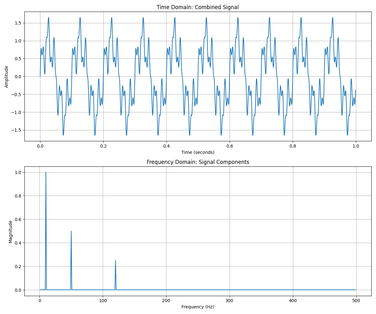
The beauty of this decomposition becomes evident in the lower plot. What appears as a complex waveform in the time domain reveals itself as three distinct peaks in the frequency domain, each corresponding to one of our original frequency components.
What do we learn from this visualization?
- Each peak represents one of our original frequency components (10Hz, 50Hz, 120Hz)
- The height of each peak shows the amplitude of that component
- The structure perfectly reveals what we built: the 10Hz component has the highest amplitude, the 50Hz component half as much, and the 120Hz component a quarter of the amplitude
This ability to decompose signals isn't just mathematically elegant—it's the foundation for countless technologies:
- Communication systems that separate desired signals from unwanted interference
- Medical devices that filter out noise from biological signals
- Earthquake detection systems that identify specific seismic wave patterns
- Speech recognition technologies that analyze vocal frequencies
The Fourier Transform gives us a lens through which complex phenomena become understandable, manipulable components.
Images Through the Frequency Prism
The revelation that truly changed my perspective as an engineer came when I first understood that images, too, could be viewed through the lens of frequency. A photograph isn't just a static grid of pixels; it's a rich tapestry of spatial frequencies.
In this context, "frequency" refers not to temporal oscillations but to how rapidly the intensity or color changes across the image. High frequencies represent abrupt changes like edges and fine details, while low frequencies correspond to slowly changing regions like smooth gradients and backgrounds.
To transform an image from the spatial domain to the frequency domain, we use the 2D Fourier Transform, which extends the concept we explored earlier into two dimensions. Let's see how this works with a concrete example:
import numpy as np
import matplotlib.pyplot as plt
from scipy import fftpack
from skimage import io, color
from skimage.filters import gaussian

# Load an image and convert to grayscale
image = io.imread('sample_image.jpg')
if image.ndim == 3:  # Convert to grayscale if image is RGB
    image = color.rgb2gray(image)

# Compute the 2D FFT
image_fft = fftpack.fft2(image)
# Shift the zero-frequency component to the center
image_fft_shifted = fftpack.fftshift(image_fft)
# Calculate the magnitude spectrum
magnitude_spectrum = 20 * np.log10(np.abs(image_fft_shifted) + 1)

# Create a low-pass filter (removing high frequencies)
rows, cols = image.shape
crow, ccol = rows // 2, cols // 2
mask = np.ones((rows, cols), dtype=np.uint8)
r = 30  # Filter radius
center = [crow, ccol]
x, y = np.ogrid[:rows, :cols]
mask_area = (x - center[0])**2 + (y - center[1])**2 <= r*r
mask[~mask_area] = 0

# Apply the mask to the FFT
fft_filtered = image_fft_shifted * mask
# Shift back
fft_filtered = fftpack.ifftshift(fft_filtered)
# Inverse FFT to get the filtered image
image_filtered = np.real(fftpack.ifft2(fft_filtered))

# For comparison, let's create the same effect using Gaussian blur
image_gaussian = gaussian(image, sigma=5)

# Visualize the results
plt.figure(figsize=(15, 12))

plt.subplot(2, 2, 1)
plt.imshow(image, cmap='gray')
plt.title('Original Image')
plt.axis('off')

plt.subplot(2, 2, 2)
plt.imshow(magnitude_spectrum, cmap='viridis')
plt.title('Frequency Domain (Magnitude Spectrum)')
plt.colorbar(label='Magnitude (dB)')
plt.axis('off')

plt.subplot(2, 2, 3)
plt.imshow(image_filtered, cmap='gray')
plt.title('Low-pass Filtered (Frequency Domain)')
plt.axis('off')

plt.subplot(2, 2, 4)
plt.imshow(image_gaussian, cmap='gray')
plt.title('Gaussian Blurred (Spatial Domain)')
plt.axis('off')

plt.tight_layout()
plt.savefig('image_frequency_analysis.png')
plt.show()
This code takes an image, converts it to the frequency domain using the 2D FFT, visualizes the frequency spectrum, and demonstrates frequency filtering by creating a low-pass filter that removes high-frequency components (fine details), effectively blurring the image.
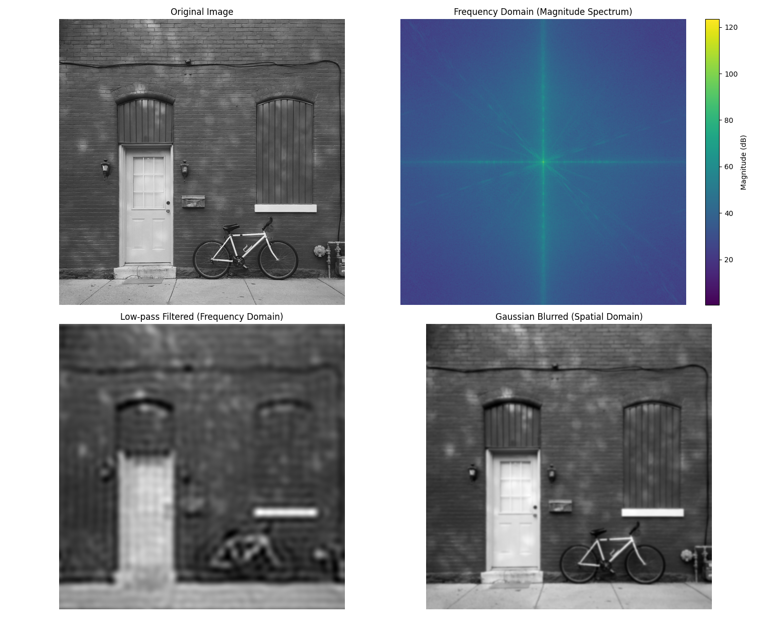
When we examine the frequency domain representation (the top-right image), we see a fascinating pattern:
What does the frequency spectrum reveal?
- The bright center represents low frequencies – broad, slowly varying features
- As we move outward, we encounter higher frequencies – finer details, edges, textures
- The brightness indicates the strength of each frequency component
- Natural images typically have most energy concentrated in the lower frequencies
By applying our circular mask in the frequency domain, we've filtered out the high frequencies while preserving the low frequencies.
The result is visually similar to applying a Gaussian blur in the spatial domain, but the approaches are conceptually quite different:
- In frequency filtering: we directly manipulate the frequency components
- In spatial filtering: we apply an operation that indirectly affects frequencies
This demonstrates how the same visual effect can be achieved through different mathematical approaches, highlighting the deep connection between the spatial and frequency domains.
Beyond Perception: Applications that Transform Our World
The power of frequency analysis extends far beyond these academic examples. Let's explore how this perspective transforms our technological landscape.
Medical Imaging
In medical imaging, frequency domain manipulation is at the heart of technologies like MRI and CT scans. These techniques don't just capture static images – they acquire data in the frequency domain and then transform it into spatial representations that physicians can interpret.
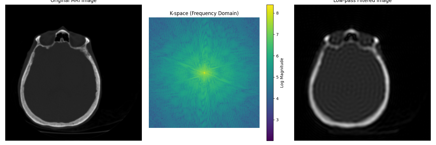
For example, MRI scanners measure the radio frequency signals emitted by hydrogen atoms in the body when placed in a strong magnetic field. The raw data exists in what's called "k-space" – essentially the frequency domain – and must be transformed using inverse Fourier transforms to create the anatomical images doctors use for diagnosis.
# Example of examining MRI k-space and reconstruction
import numpy as np
import matplotlib.pyplot as plt
from skimage import data, color
from scipy import fftpack

# Load a sample image to simulate an MRI scan result
# In practice, this would come from an actual MRI scanner's k-space
image = data.brain()[0]  # Using scikit-image's sample brain MRI

# Convert to k-space (frequency domain) using FFT
kspace = fftpack.fft2(image)
kspace_shifted = fftpack.fftshift(kspace)  # Shift zero-frequency component to center

# Create a visualization of k-space (log scale for better visualization)
kspace_magnitude = np.log10(np.abs(kspace_shifted) + 1)  # Add 1 to avoid log(0)

# Reconstruct the image from k-space
reconstructed_image = np.abs(fftpack.ifft2(kspace))

# Demonstrate a simple k-space filtering (low-pass filter)
# Create a circular mask for the center of k-space
rows, cols = image.shape
crow, ccol = rows // 2, cols // 2
radius = 30  # Filter radius

# Create the mask
y, x = np.ogrid[:rows, :cols]
mask = ((y - crow)**2 + (x - ccol)**2 <= radius**2)
mask = fftpack.fftshift(mask)

# Apply the mask to k-space
filtered_kspace = kspace * mask
filtered_image = np.abs(fftpack.ifft2(filtered_kspace))

# Visualize results
plt.figure(figsize=(15, 5))

plt.subplot(131)
plt.imshow(image, cmap='gray')
plt.title('Original MRI Image')
plt.axis('off')

plt.subplot(132)
plt.imshow(kspace_magnitude, cmap='viridis')
plt.title('K-space (Frequency Domain)')
plt.axis('off')
plt.colorbar(label='Log Magnitude')

plt.subplot(133)
plt.imshow(filtered_image, cmap='gray')
plt.title('Low-pass Filtered Image')
plt.axis('off')

plt.tight_layout()
plt.savefig('mri_processing.png')
plt.show()
This example demonstrates how MRI data analysis works with frequency domain processing. We visualize both the spatial domain (the actual MRI image) and the k-space representation (frequency domain). The filtering example shows how manipulating frequencies can affect the final image, similar to how MRI technicians might process scan data to enhance specific features.
Compression: Finding Essence in Frequency
Another remarkable application of frequency analysis is data compression. Consider the JPEG image format, which uses the Discrete Cosine Transform (DCT) – a close relative of the Fourier Transform – to represent images more efficiently.
The power of DCT comes from the observation that most natural images have their energy concentrated in low frequencies, with relatively little information in high frequencies. By quantizing or discarding some high-frequency components, we can dramatically reduce file size while maintaining perceptual quality.
# Demonstrate JPEG-like compression using DCT with scikit-image

import numpy as np
import matplotlib.pyplot as plt
from skimage import data, color
from scipy.fftpack import dct, idct

def dct2(block):
    """2D Discrete Cosine Transform"""
    return dct(dct(block.T, norm='ortho').T, norm='ortho')

def idct2(block):
    """2D Inverse Discrete Cosine Transform"""
    return idct(idct(block.T, norm='ortho').T, norm='ortho')

# Load a standard test image
image = data.camera()

# Extract a small block for demonstration
block_size = 8  # JPEG uses 8x8 blocks
block = image[128:128+block_size, 128:128+block_size]

# Apply DCT to the block
dct_block = dct2(block)

# Create compression visualizations at different quality levels
compression_ratios = [0, 0.25, 0.5, 0.75, 0.9]
reconstructed_blocks = []

plt.figure(figsize=(15, 10))

# Original block and its DCT
plt.subplot(2, 4, 1)
plt.imshow(block, cmap='gray')
plt.title('Original 8x8 Block')
plt.axis('off')

plt.subplot(2, 4, 2)
plt.imshow(np.log(np.abs(dct_block) + 1), cmap='viridis')
plt.title('DCT Coefficients')
plt.axis('off')

# Show different compression levels
for i, ratio in enumerate(compression_ratios[1:], 1):
    # Copy the DCT coefficients
    compressed_dct = dct_block.copy()

    # Sort DCT coefficients by absolute value
    dct_abs = np.abs(compressed_dct).flatten()
    sorted_indices = np.argsort(dct_abs)

    # Zero out the smallest coefficients based on ratio
    threshold_idx = int(block_size * block_size * ratio)
    compressed_dct.flat[sorted_indices[:threshold_idx]] = 0

    # Reconstruct from compressed DCT
    reconstructed = idct2(compressed_dct)
    reconstructed_blocks.append(reconstructed)

    # Display the result
    plt.subplot(2, 4, i+2)
    plt.imshow(reconstructed, cmap='gray')
    plt.title(f'{int(ratio*100)}% Coefficients Zeroed')
    plt.axis('off')

# Show the full image and a compressed version
plt.subplot(2, 4, 7)
plt.imshow(image, cmap='gray')
plt.title('Full Original Image')
plt.axis('off')

# Create a full image compression demonstration
full_compressed = np.zeros_like(image)
for i in range(0, image.shape[0], block_size):
    for j in range(0, image.shape[1], block_size):
        if i+block_size <= image.shape[0] and j+block_size <= image.shape[1]:
            block = image[i:i+block_size, j:j+block_size]
            dct_block = dct2(block)

            # Threshold at 75% compression
            dct_abs = np.abs(dct_block).flatten()
            sorted_indices = np.argsort(dct_abs)
            threshold_idx = int(block_size * block_size * 0.75)
            dct_block.flat[sorted_indices[:threshold_idx]] = 0

            full_compressed[i:i+block_size, j:j+block_size] = idct2(dct_block)

plt.subplot(2, 4, 8)
plt.imshow(full_compressed, cmap='gray')
plt.title('75% Compression (Full Image)')
plt.axis('off')

plt.tight_layout()
plt.savefig('dct_compression.png')
plt.show()
This code demonstrates how the DCT transforms image blocks into frequency coefficients, and how we can achieve compression by selectively removing coefficients, starting with those carrying the least perceptual information.
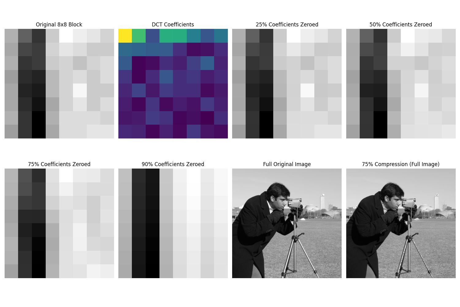
As we increase the compression factor, more coefficients are zeroed out, resulting in a loss of detail. Yet remarkably, even with 75% of the coefficients removed, the image remains recognizable. This is because the DCT concentrates the most perceptually important information in a small number of coefficients, typically in the upper-left corner representing low frequencies.
The Philosophical Resonance of Frequency
As we conclude this exploration, I find myself returning to the philosophical question posed at the beginning: what does it mean that frequency shapes our perception of reality?
The Fourier perspective suggests something profound – that complexity emerges from simplicity, that seemingly chaotic systems can be understood as the superposition of simple, rhythmic patterns. This isn't just a mathematical convenience; it offers a glimpse into the underlying structure of the universe.
The Fundamental Nature of Reality
Consider these profound connections:
- Quantum mechanics describes particles as wave functions
- String theory proposes that fundamental particles are actually tiny vibrating strings
- Light and matter exhibit wave-particle duality
At the most fundamental level, our reality seems to be composed of frequencies and vibrations.
Our Bodies as Frequency Analyzers
Even our sensory systems are fundamentally frequency analyzers:
- The cochlea in our inner ear performs a mechanical Fourier Transform, separating sound waves into their component frequencies
- Our visual system has cells that respond to specific spatial frequencies and orientations
- Our sense of touch detects vibrations across a range of frequencies
This connection between mathematics and biology is not coincidental—it reflects a deep harmony between our perception and the structure of reality itself.
Extending Our Senses Through Technology
In teaching machines to "see" frequencies, we are, in a way, teaching them to perceive reality in a manner that mirrors our own biological systems. Yet they can extend this perception beyond human limitations:
- Detecting radio waves
- Analyzing infrared radiation
- Processing ultrasound
- Interpreting magnetic resonance data
This capacity to transcend biological constraints through mathematical understanding is, to me, one of the most beautiful aspects of signal processing and artificial intelligence. We've developed tools that not only mirror our own perception but enhance and extend it, revealing aspects of reality that would otherwise remain hidden.
The Convergence of Perception and Computation
As we continue to advance these technologies, the line between perception and computation grows increasingly blurred. The algorithms we've explored aren't just mathematical abstractions—they're lenses through which we can view the world:
- Extracting meaning from complexity
- Finding patterns in noise
- Revealing the hidden rhythms that underlie our reality
In the words of Heinrich Hertz, who first experimentally confirmed the existence of electromagnetic waves: "I do not think that the wireless waves I have discovered will have any practical application."
How wrong he was – and how fortunate we are to live in an age where we can not only detect these invisible frequencies but speak their language, harnessing their power to transform our understanding of the world and ourselves.
The next time you look at a digital image, hear the sound of the ocean, or use your smartphone, remember that you're experiencing the fruit of humanity's long journey to understand and manipulate frequency – nature's own language, hidden in plain sight, shaping everything we perceive and create.
End of entry · Ahmad Nayfeh · April 30, 2025

